
Mastering Website Layouts: The Beginner's Ultimate Guide
Prefer to watch?
Here’s the video!
Mentioned in the Video:
*Yup - that’s an affiliate link! My margarita fund thanks you kindly!
Rather read all about it?
Are you struggling to make your website layouts look polished and professional?
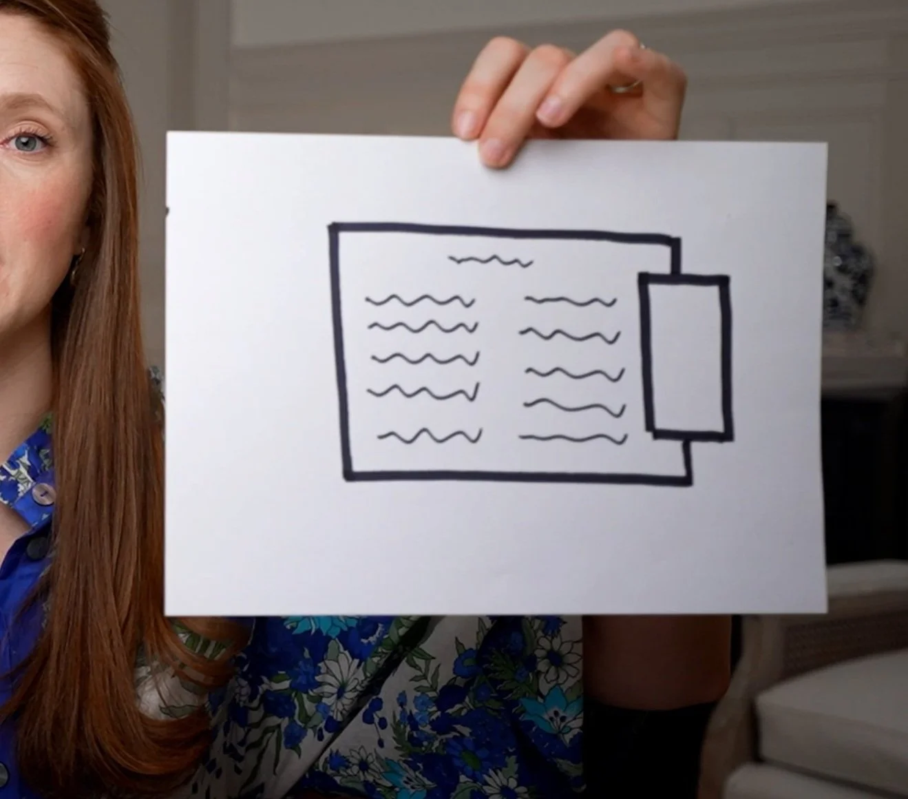
Here's what most beginner layouts look like...

Maybe it feels cluttered.
Maybe it’s confusing to navigate.
Maybe it just doesn’t have that seamless, polished flow that makes everything come together beautifully.
If that sounds familiar, don’t worry—it’s not your fault.
Designing a website layout that looks professional isn’t about luck or artistic talent. There’s a formula that top designers use, and most beginners totally overlook it.
Today, I’m pulling back the curtain and showing you exactly how to structure a website layout that:
✔︎ hooks visitors
✔︎ keeps them engaged
✔︎ inspires them to take action
Whether that’s clicking the buy button, signing up for your newsletter, or reaching out to work with you.
And the best part?
It’s not as complicated as you might think.
With just a few strategic tweaks, you can take your website from amateur to polished without endless trial and error.
The mistakes you’re making right now? They’re much easier to fix than figuring out IKEA instructions—I promise.
So grab your favorite coffee (or tea), because by the end of this post, you’ll have a clear roadmap to designing layouts that look polished, feel cohesive, and actually keep visitors engaged.

The Golden Rule: Content Guides Design
Here’s the first thing you need to know about designing a website layout that looks polished: great layouts aren’t random.
They follow a specific formula, and the number one rule is content guides design.
If you’re designing first and then trying to stuff your content into it, you’re doing it backward.
For example:
If I started with a pre-made layout I loved…

and then tried to fit my copy into it..
it would look….
awkward and cluttered.
The clear problem here is that the content doesn’t match the layout. And this happens all the time.
Sometimes, if you’re working with a client, they might hand over content and expect you to use it exactly as provided.
But here’s the thing: it’s up to you, as the designer, to decide how that content fits into a layout. A giant paragraph might need to be split into multiple sections, or a shorter block might require a more compact design.
The Fix: Start With Content
Before you even think about how a section will look, start with your content and ask yourself:
What is the most important thing I want my visitor to see or do here?
How can I break this content into manageable sections that flow naturally?
Once you’ve identified the key message, you can choose a layout that highlights it effectively.
An Example in Action
Let’s say you’re working with a chunk of text that’s too large for a single section.
You might consider several layout options to see which one fits best.

Here, I’ve selected a layout that allows the text to be broken into three smaller sections
. This not only looks cleaner but also helps guide the visitor’s eye through the content naturally.
Notice how the text is divided, with each section given its own space.
This creates a sense of intentionality, making it easier for visitors to absorb the information without feeling overwhelmed.
How much cleaner and more intentional does this look?! 👇

By simply allowing the content to guide the design and doing a bit of tweaking ot breaknig up my content into seperate sections, everything has fallen into place perfectly
Remember: layouts are intentional. it’s about asking yourself what most important part of content is and then figuring out how to guide the viewer to it.
Practice Makes Perfect
If you’re still feeling like you’re maybe not cut out for this, i’ve got you covered. Choosing the right layouts just takes a little bit of practice which is exactly what we’re going to do now.
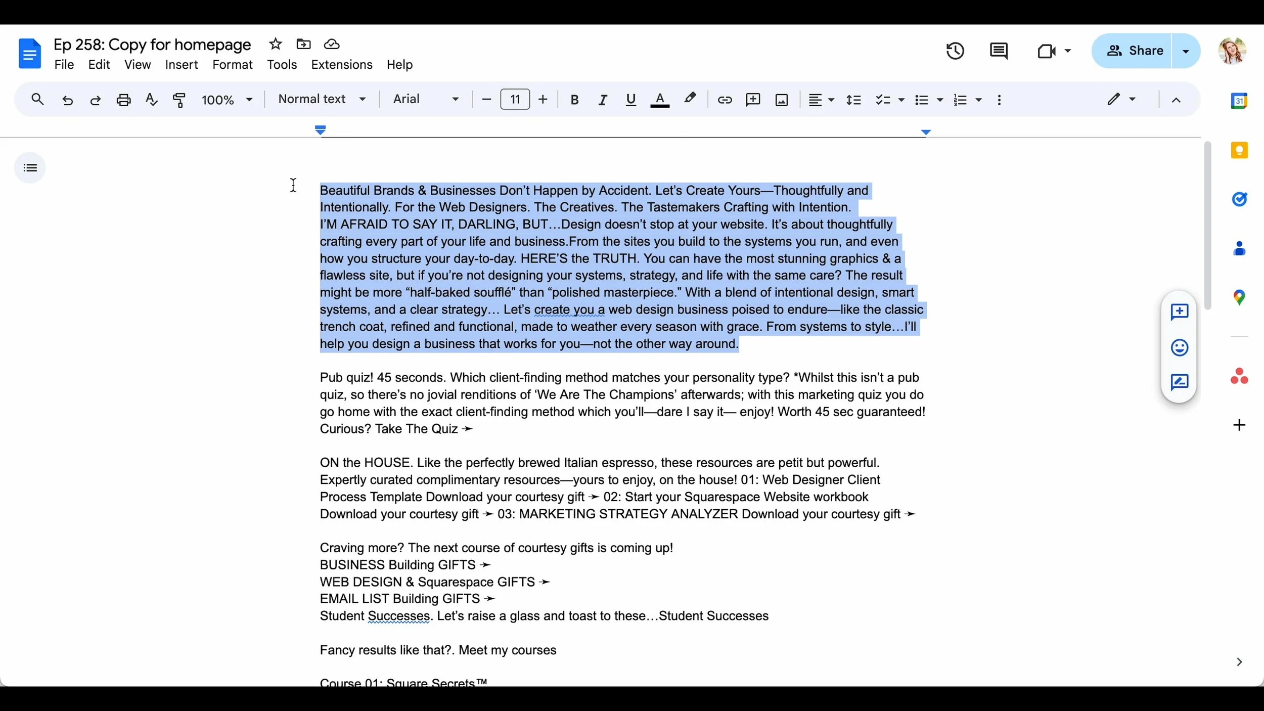
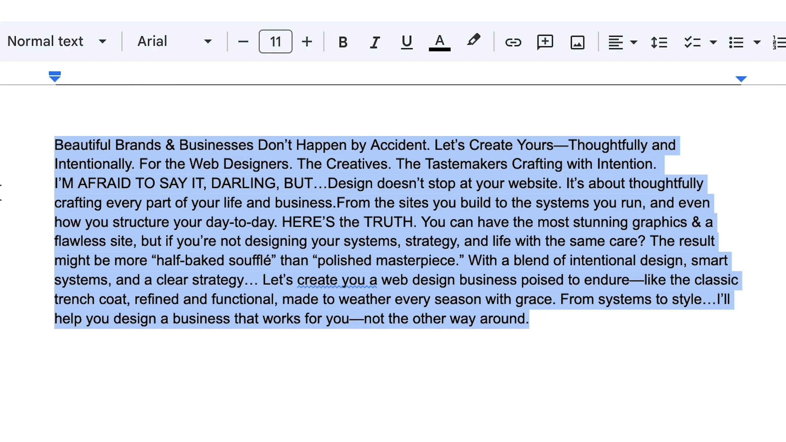
Here’s the entire text from my most recent homepage redesign.
Lets take a look at the copy and layout options and i’ll show you how i chose which layout to ultimately go with.
Choosing Formating for Medium Length Copy Texts
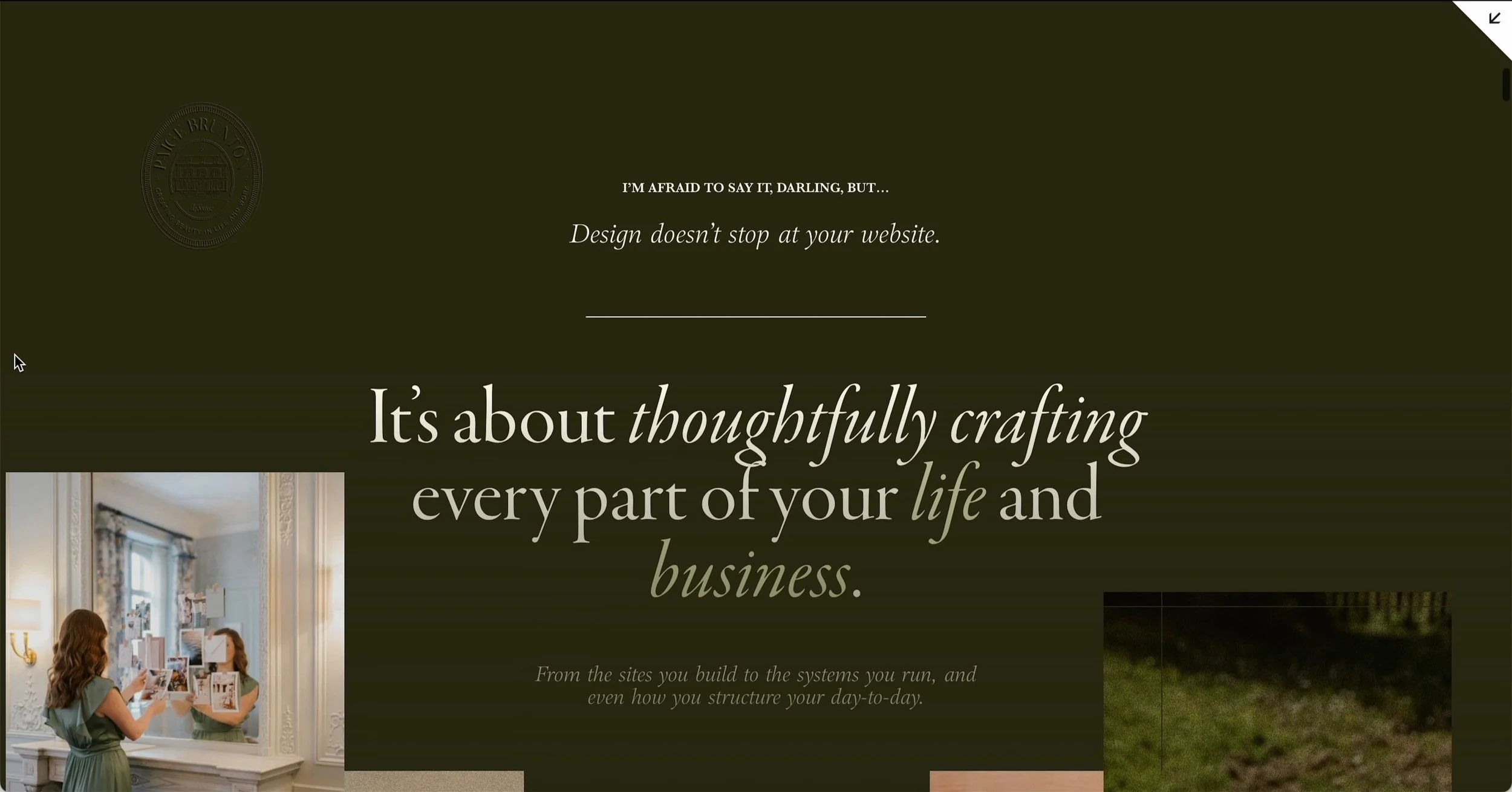
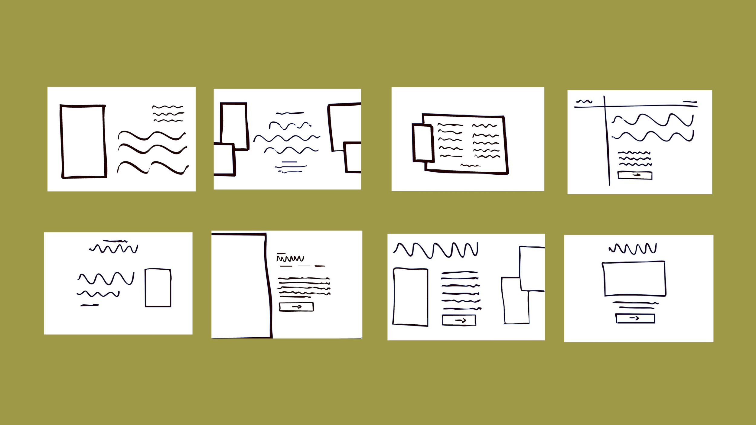
Question: this is a medium amount of text for a section and we need to determine which of the following layouts would fit best…

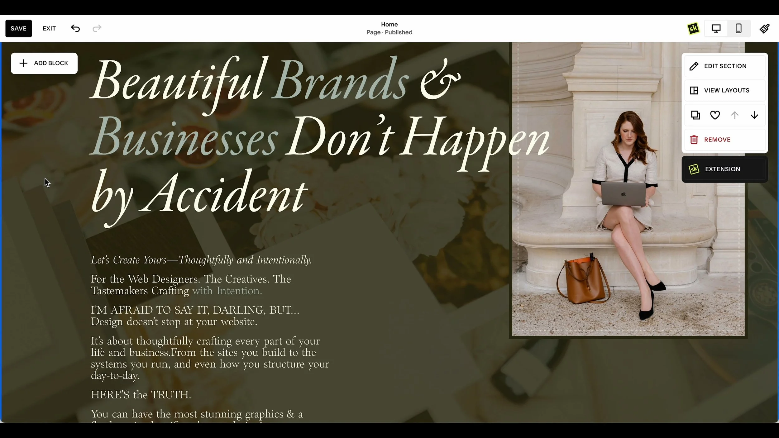
Answer: I went with this layout! 👇

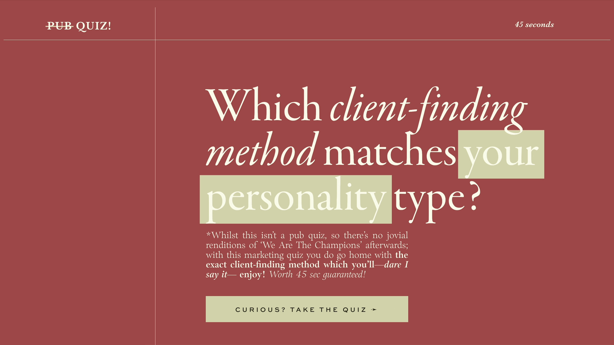

Why does this layout work?
Visual decoration: For this particular piece of content, the chosen layout included “pub quiz” in the top left corner and “45 seconds” in the top right corner—elements that act more like fun visual accents rather than key information.
These playful details add character to the design without distracting from the more essential content.
Clear text hierarchy: the layout allows the headline to stand out prominently, with space for a short, impactful paragraph and a clear call-to-action button below. The most important text is clearly highlighted.
Negative space: This design is intentionally not overcrowded—there’s plenty of negative space that ensures the important elements are easy to focus on.
If the layout had additional text or clutter, it would lose its clean, polished feel. By keeping things simple and giving each element its space, the design feels both professional and engaging.
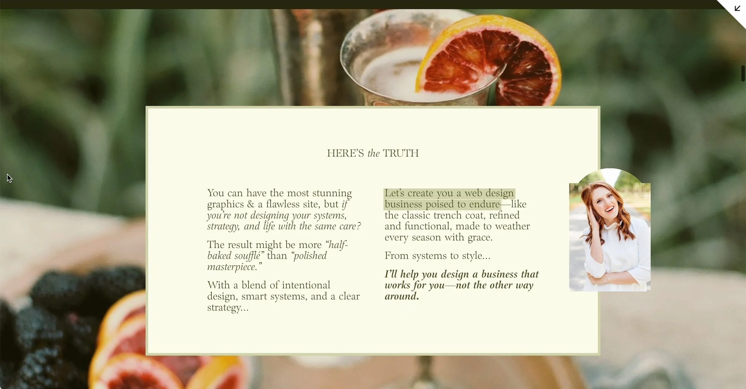
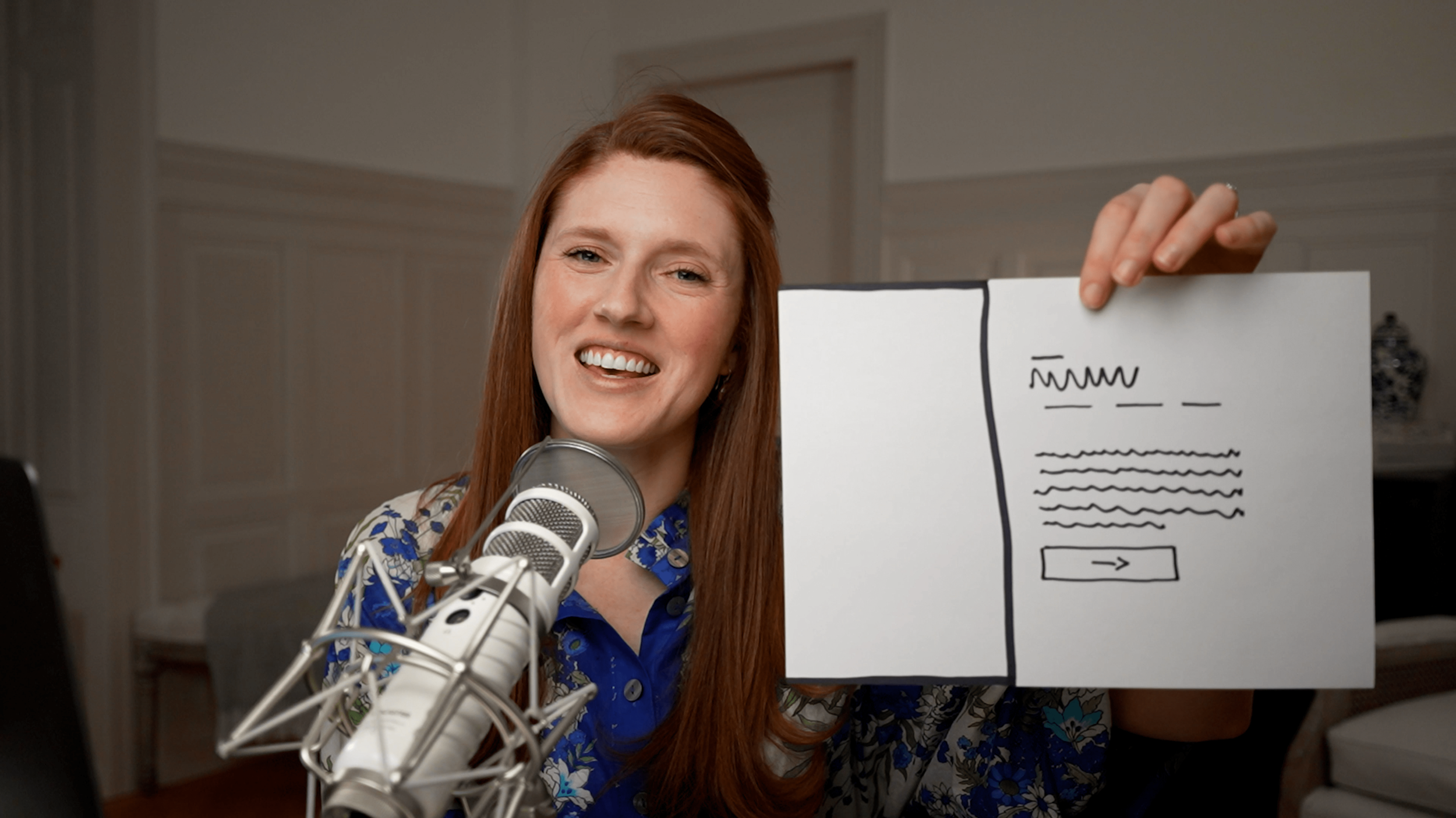
Designing Layouts for Short and Decorative Text
The next section of my homepage features the phrase: “On the house. Like the perfectly brewed Italian espresso. These resources are petite but powerful.”
It’s a small amount of text—decorative rather than essential—but it still plays a crucial role in reinforcing the brand’s personality and vibe.
Question: which of these 4 layouts do you think fits the text best?
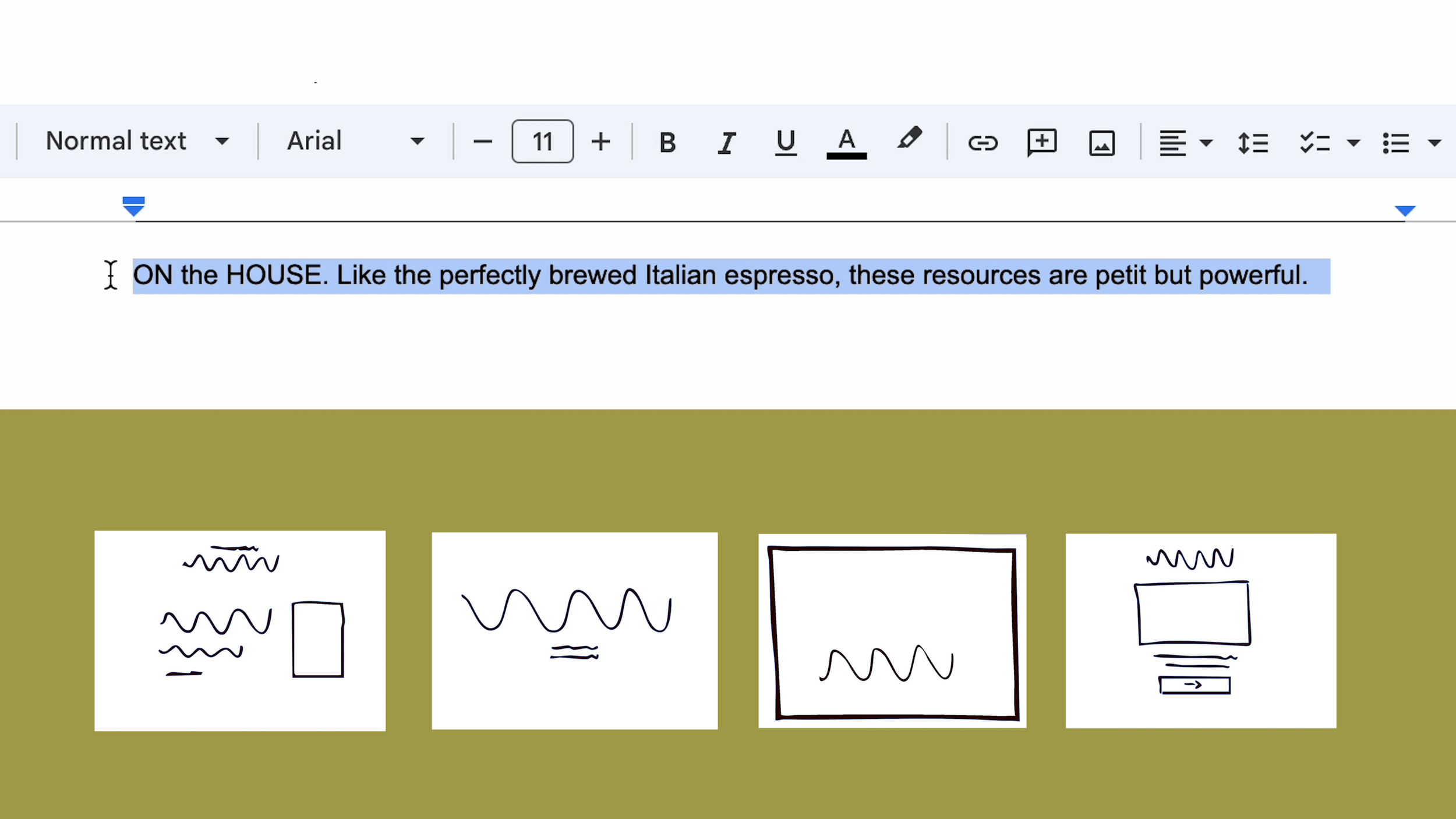
Answer: For this kind of text, which adds character rather than conveying critical information, the layout needs to highlight its charm without overwhelming the design.
I reviewed my potential layouts and selected one that allowed the text to shine without demanding too much attention. 👇

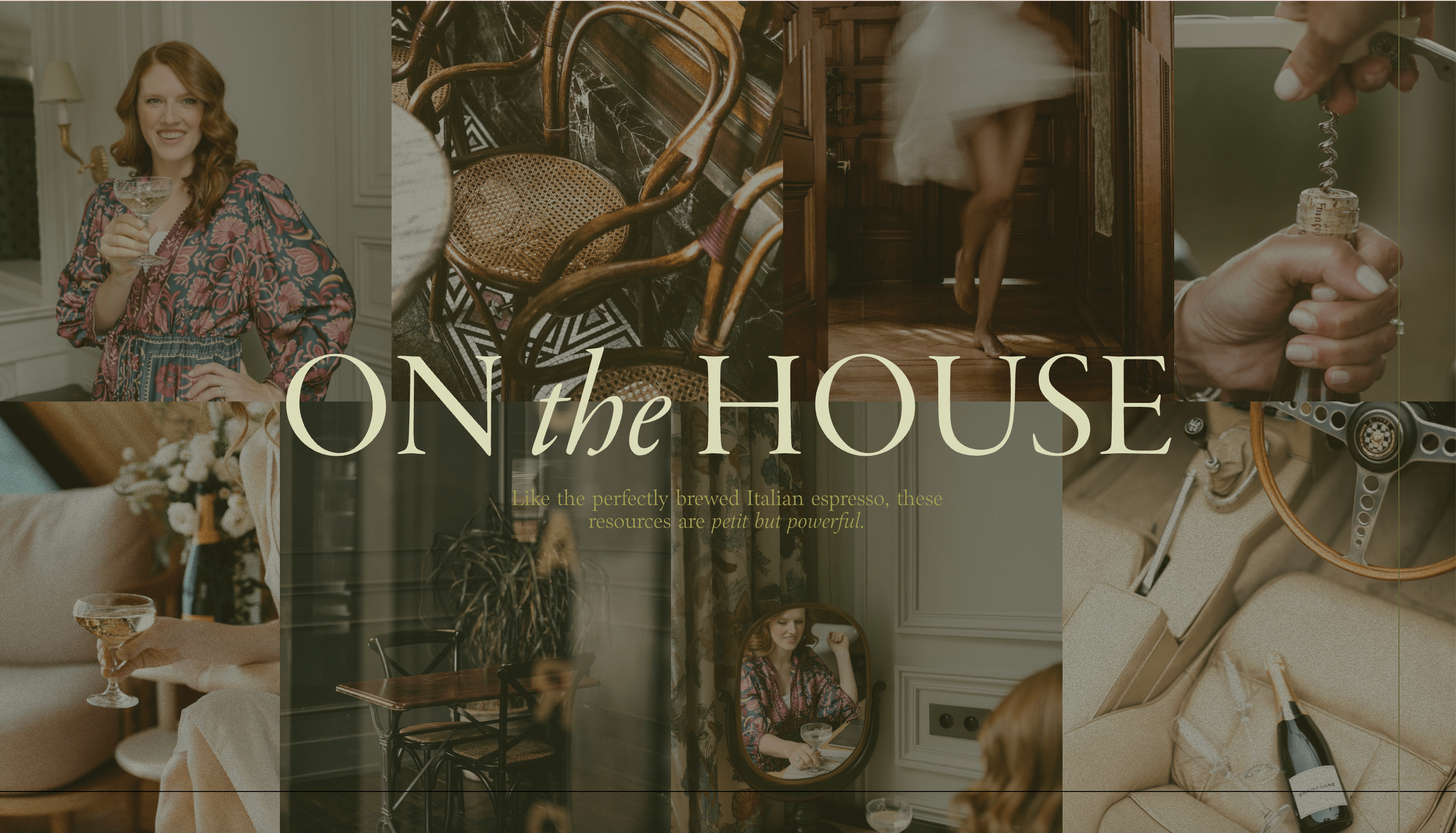

This layout works beautifully because:
It’s photo-dominant: With the text intentionally minimized, the section leans into the visuals, letting them create a rich, inviting backdrop.
The text is clear and legible: While it’s not vital for the visitor to read every word, the typography and placement ensure the text is accessible and adds to the brand vibe.
It enhances the aesthetic: in the final design, you’ll notice that the imagery in the background enhances the aesthetic while ensuring the text maintains its playful, coffee-inspired tone.
This balance is essential when working with decorative text—it shouldn’t compete with the rest of the page but rather complement it.
Designing Layouts for Freebies Sections
The next section of the homepage promotes my freebies. While the text here is also brief, it’s important that visitors can quickly read and understand the options.
Question: which of these 4 layouts do you think fits the text best?
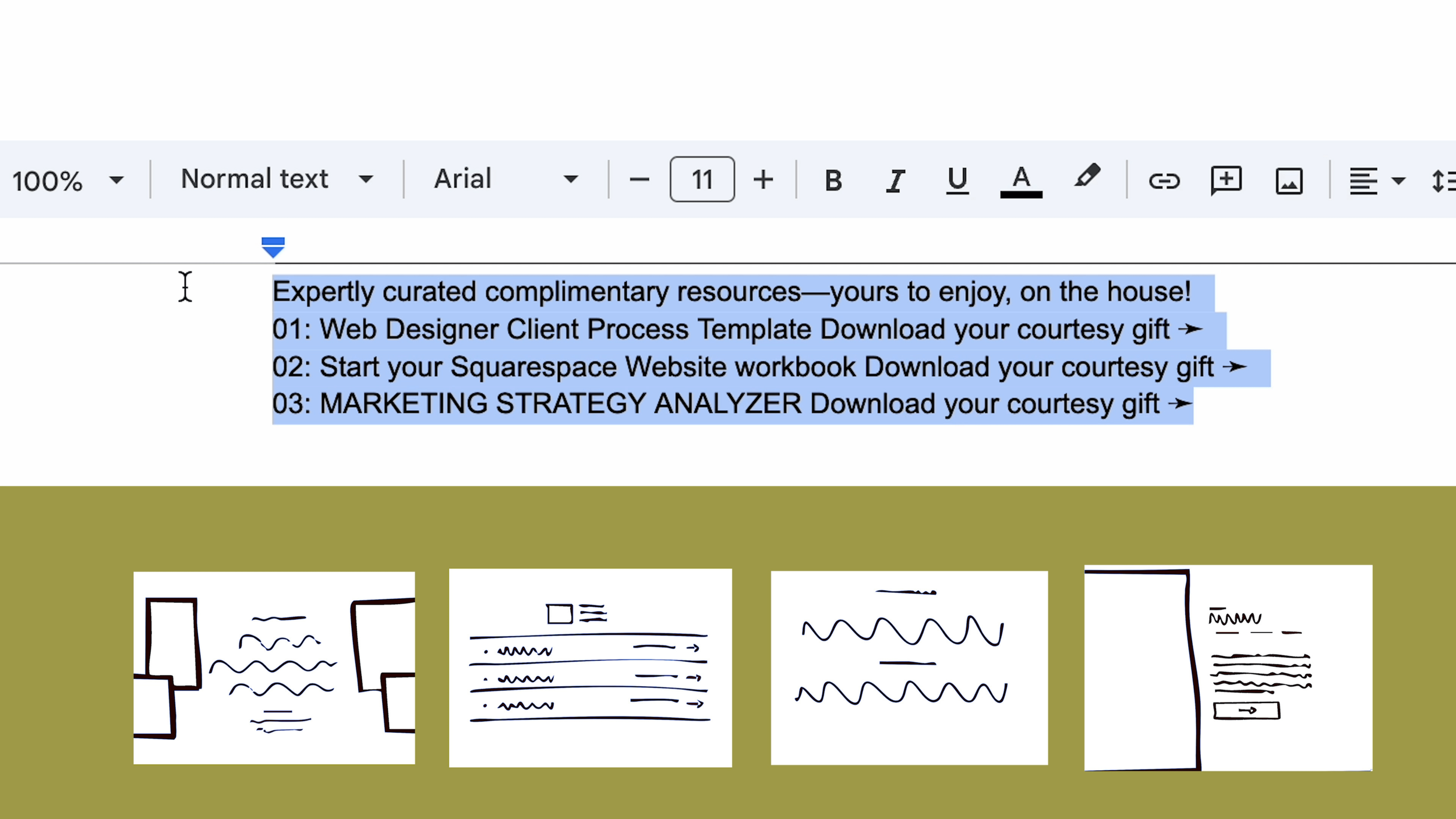
Answer: I opted for a layout that is clean, structured, and straightforward.
Each opt-in offer is displayed in its own clearly defined row, separated by clean lines, which makes it easy to differentiate between the options.
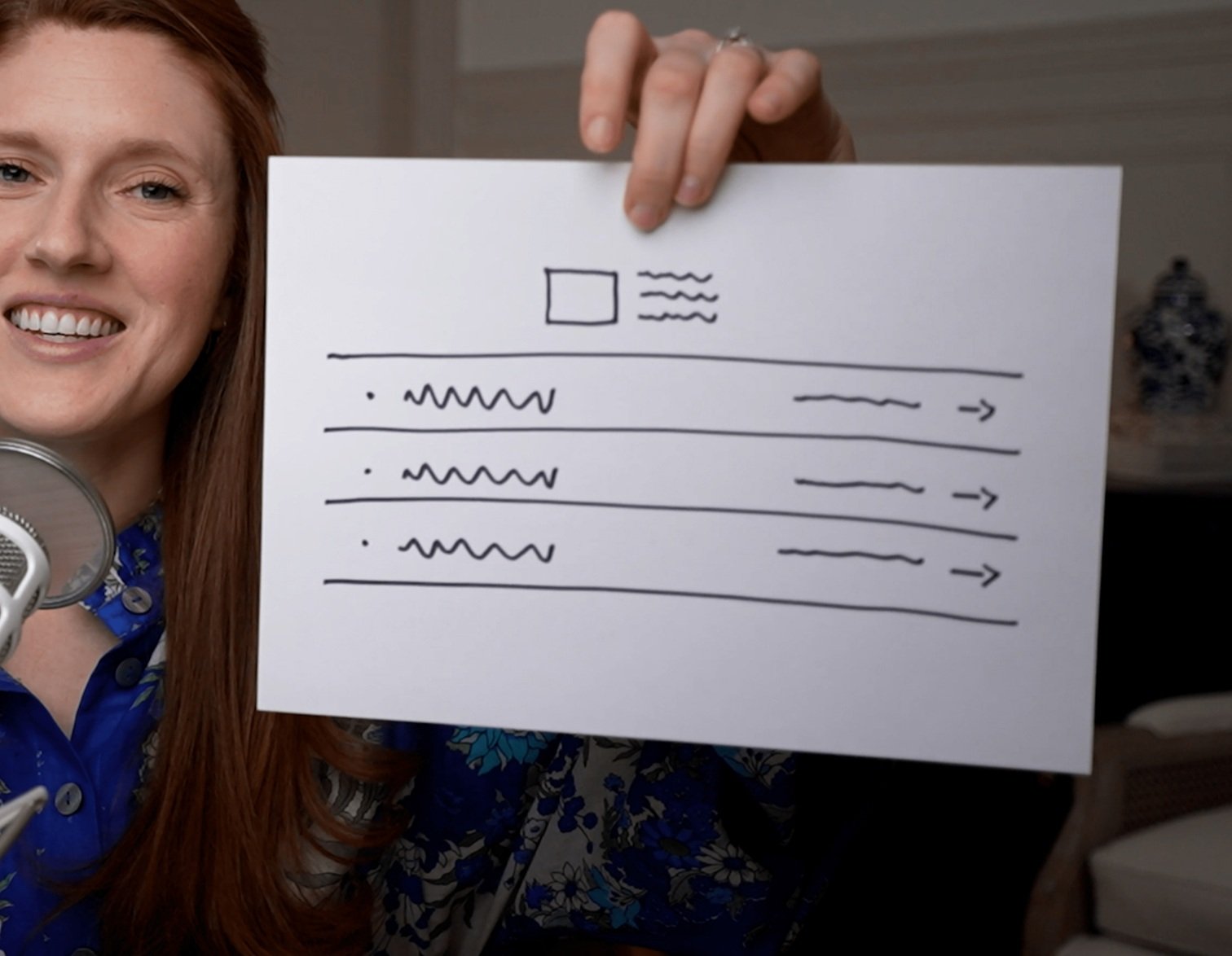

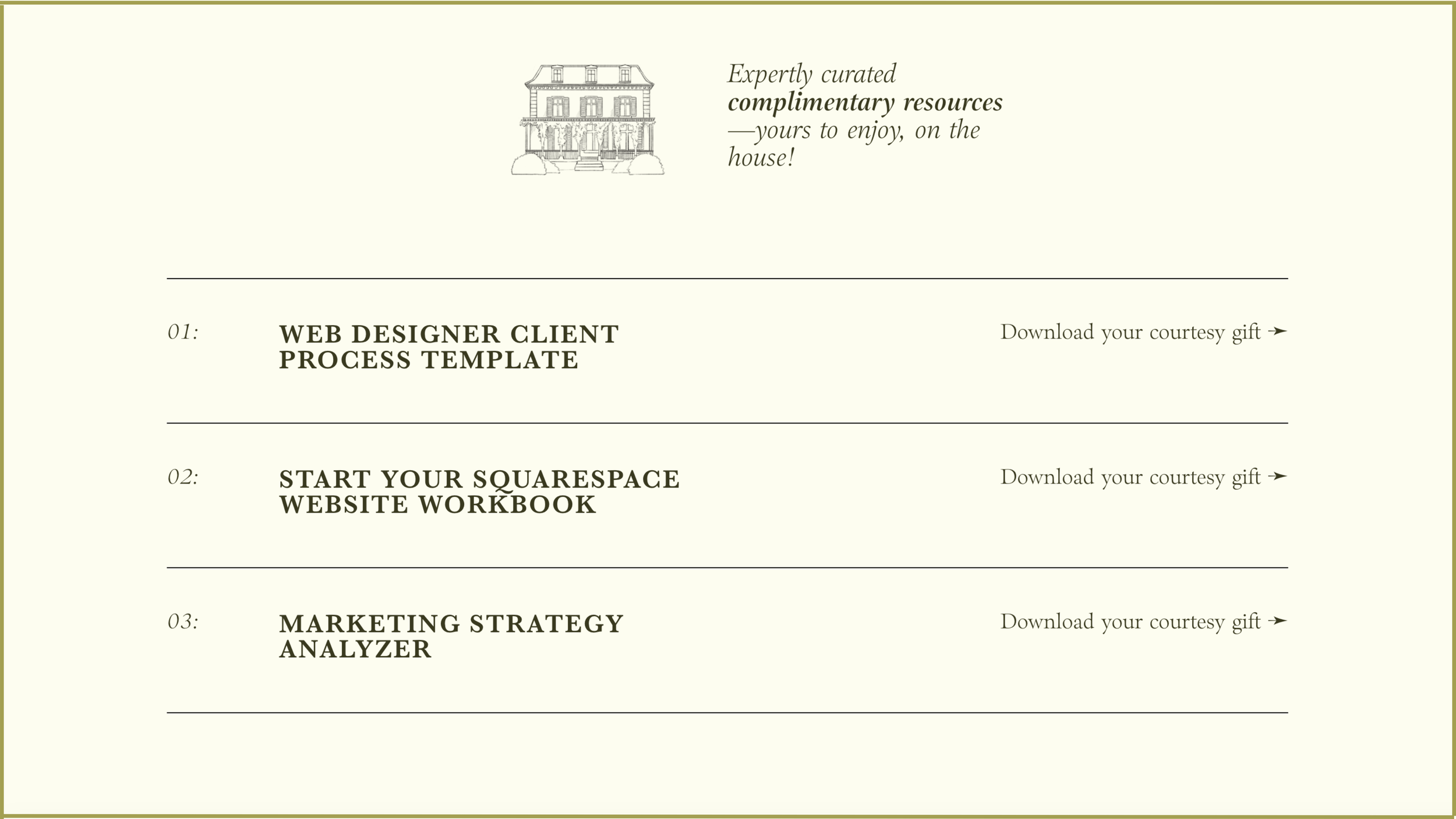

To add some visual interest to what could otherwise be a very plain section, I included a small graphic at the top that ties back to the “On the House” theme from the previous section.
It’s a subtle nod to the overall branding while keeping the design cohesive and professional.

Designing Layouts for Course Previews
Moving further down the homepage, we come to the courses section.
This area introduces my three different courses and requires more text than previous sections.
Question: which of these 8 layouts do you think fits the text best?
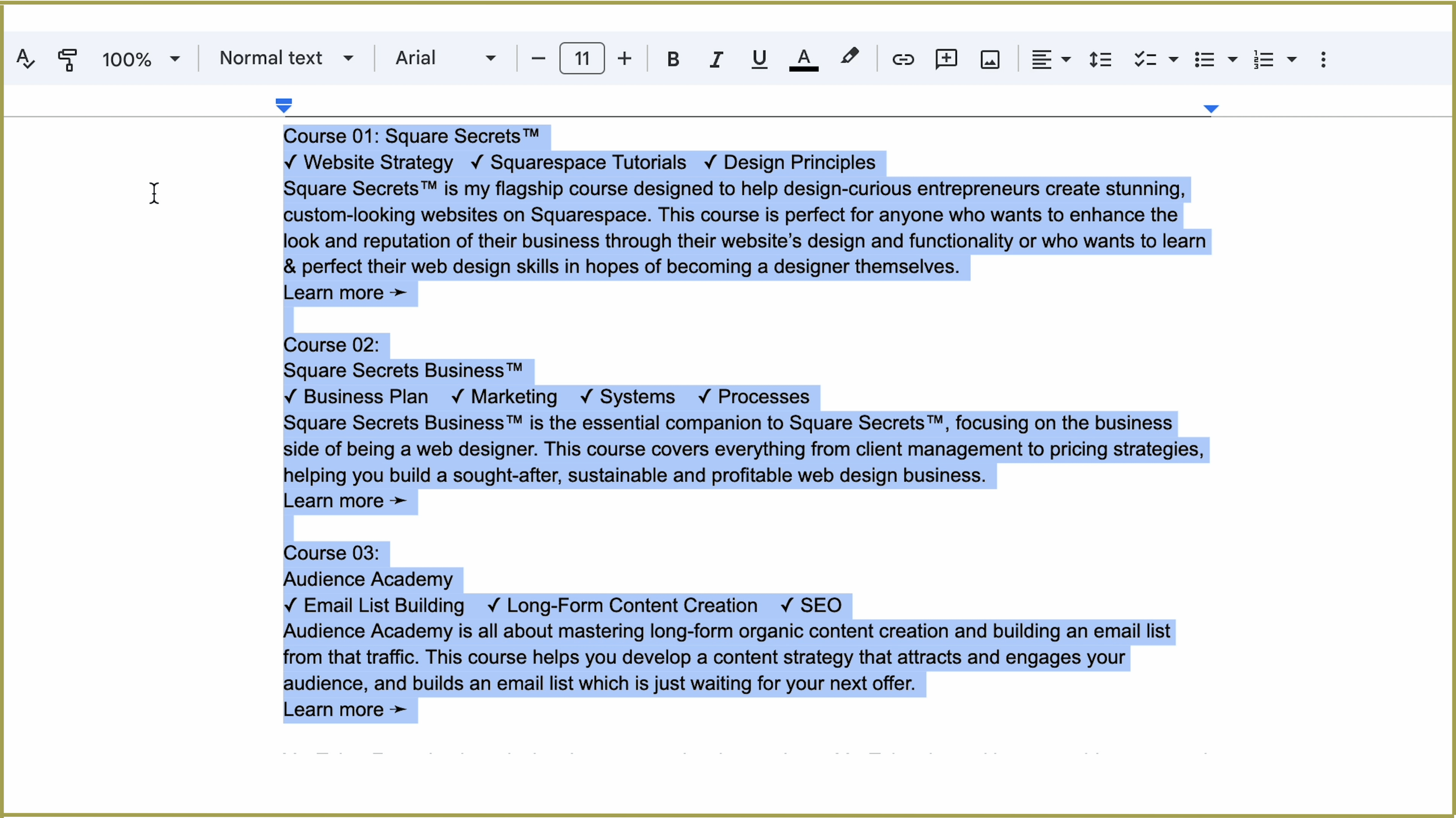


Answer: I chose a layout that allows the content to breathe, giving each course the attention it deserves. This way, visitors can focus on one course at a time, rather than feeling bombarded with information.

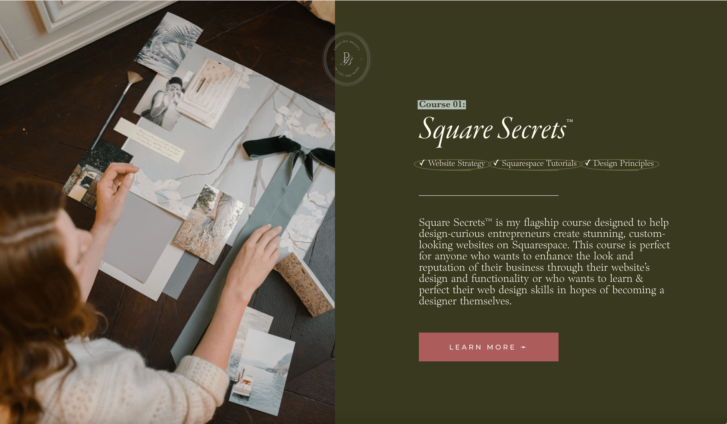


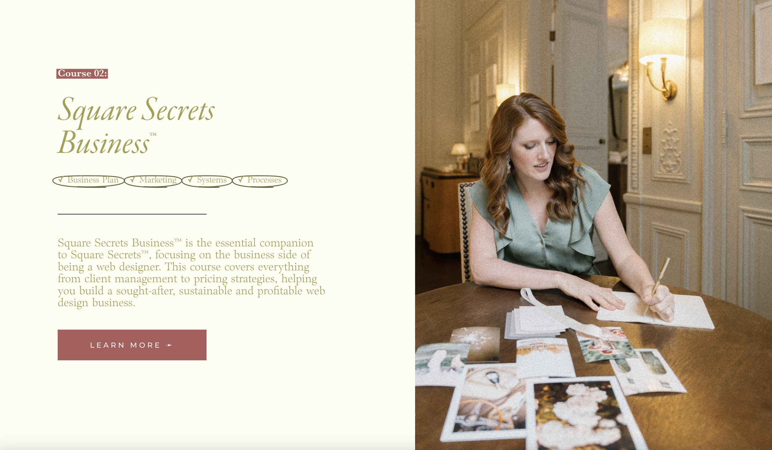
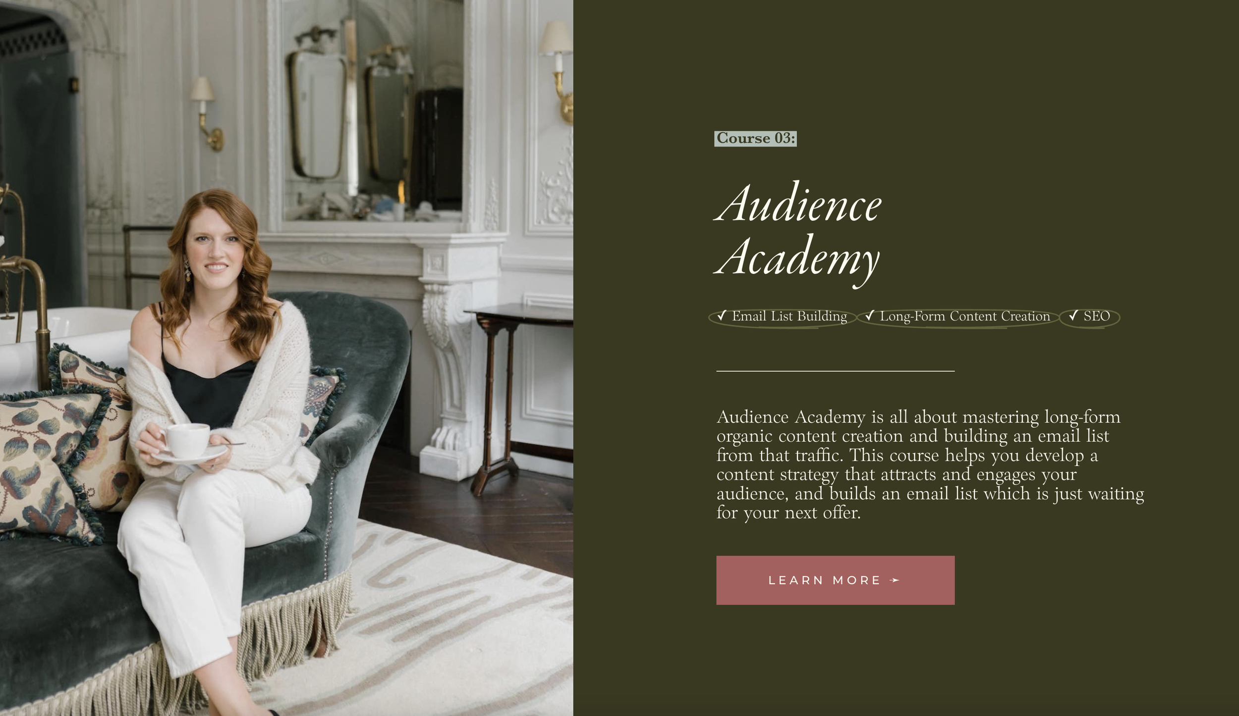

how to implement this:
Divide the content: Each course is given its own section to avoid overwhelming the visitor with too much information at once. This structure helps clearly define and separate each course, ensuring visitors can easily find the details they need.
Add a heading for clarity: A unifying heading grounds the entire section and gives context to what follows.
Use a consistent yet varied layout: For each course, I used a similar layout to create a sense of cohesion, but I alternated the image placement—left for one course, right for the next, and so on.
This subtle variation keeps the section visually engaging while reinforcing that all three courses are part of the same offering.
Psst…still figuring out what to actually write on your homepage? here’s a homepage content planner on the house!
Layout Tips to Keep in Mind
1. Divide ideas & content into sections
Each topic or idea should have its own visual space. For example, an “About” section, a “Freebies” section, and a “Courses” section should all be distinct.
2. Every Section Should Have a Purpose
Great layouts are not about cramming as much as you can into every corner. Instead, think about:
What do I want people to notice first?
How can I guide them to take the next step?
By focusing on what’s most important in each section, you’ll create designs that feel cohesive and professional.
Let Content Drive Your Layout Choices. Different types of content call for different layouts. For instance:
Short, snappy text works well in a bold hero section.
Medium-length content pairs beautifully with split layouts (text on one side, image on the other).
Long-form content should be divided into multiple sections with clear subheadings.
3. Break Up Long Text
It’s up to you as a designer to decide how to chop up your client’s copy.
When dealing with longer content, don’t be afraid to break it into smaller pieces.
Refer back to your content’s structure and adjust the layout to fit.
If you’re showcasing key features or benefits, use bullet points or separate them into distinct sections.
Change up from having a photo background to a coloured background to the photo.*
*Design best practice says to avoid having multiple photo backgrounds in a row because that might start to feel a little busy. However, rules are made to be broken.
If you have experience, you can break them.
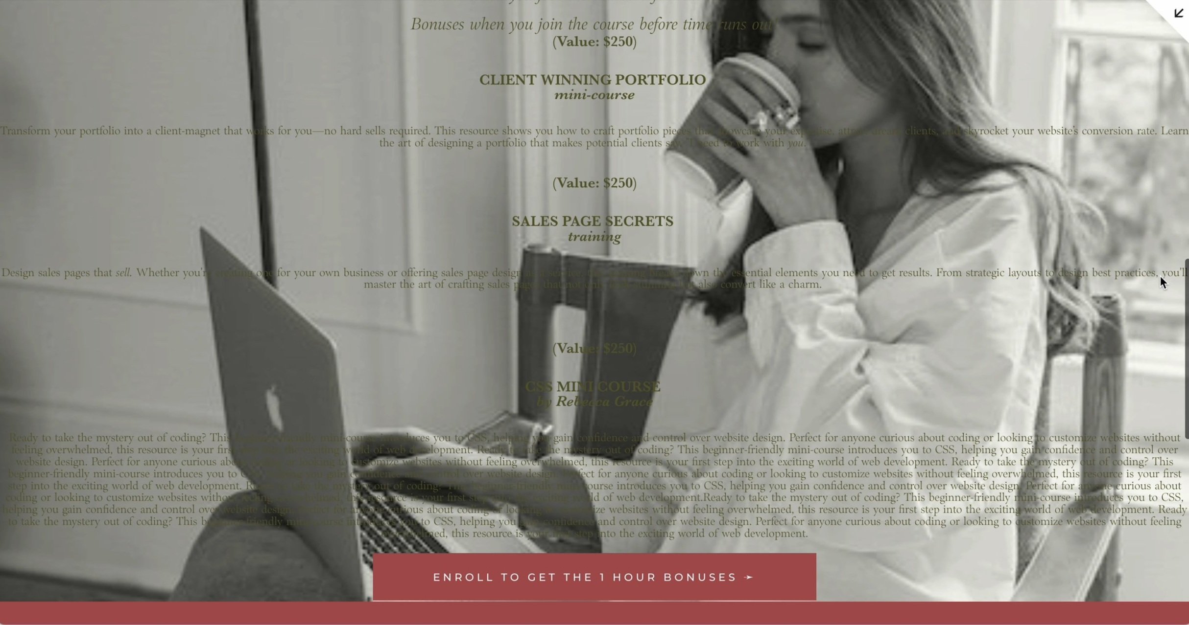
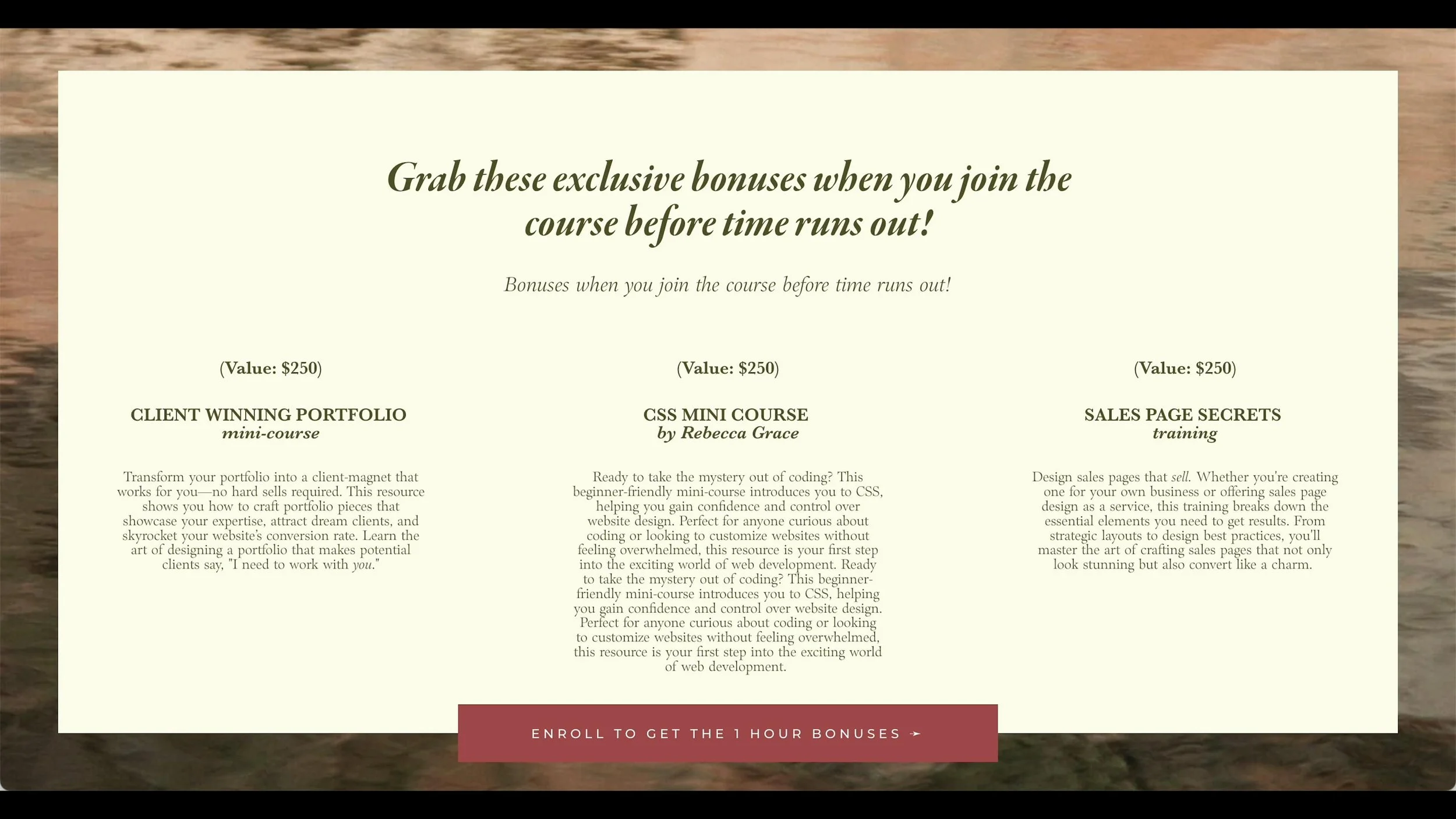
Here’s an example of how I used multiple photo backgrounds in a row on my courses page:

Why this works:
I added a white dividing line in between each section.
I used a giant square behind the text to help it stand out from the image. This helps the text to pop out as the obvious primary content and avoids the images being overly dominant.
5. Use White Space Wisely
White space isn’t just empty space—it’s a powerful design tool. It helps:
Avoid visual clutter.
Draw attention to key elements.
Create a polished, high-end look.
Think of white space as the pause between notes in a song—it gives everything else room to breathe.
Example of a section that utilizes empty space:

6. Make It Visually Interesting:
Now that we’ve covered the essentials, let’s talk about a key balance you need to strike in your layouts: making them visually interesting without letting the design overpower your content. It’s easy to go overboard with background images, doodles, or decorative elements. But at the end of the day, your layout’s primary job is to serve your content—not steal the spotlight.
Note: ´this tip definitely needs to be balanced with the use of blank space!
To achieve this balance, you’ll want to ask yourself a few questions:
Does this section feel engaging and dynamic, or is it just a wall of text?
Are the decorative elements enhancing the message, or are they creating visual noise?
For example, when designing a section with shorter, more decorative text, you might include playful doodles or subtle background imagery.
This adds personality and charm without detracting from the readability of your content. But remember: moderation is key. If your layout becomes busy, it will distract your visitor rather than guide them.Graphics
However don’t get too wild and overpower the main content of the section.
7. Keep It Consistent (But Not Repetitive)
Another essential tip is to vary your section layouts. If every section looks identical, your page will start to feel monotonous.
While consistency is crucial, you don’t want every section to look identical. Rotate between a few layout options to keep things visually interesting while maintaining a cohesive overall design.
However, there’s an exception to this rule. When showcasing similar content—such as services or courses—repeating a layout with small variations can create a sense of consistency while maintaining visual interest.
By focusing on these principles, you’ll be able to create layouts that not only look beautiful but also serve their purpose—guiding visitors through your website with ease.
By following these principles, you’ll create a website that feels cohesive, professional, and engaging—all while guiding visitors effortlessly through your content.
Putting It to the Test: Spotting Layout Mistakes
Let’s test your layout instincts. Take a look at this example:


Does it look polished and professional, or is something “off”? If your gut reaction is that it’s not working, you’re likely picking up on some key design issues.
Common Layout Mistakes:
Too much happening in one section: There’s no hierarchy or clear focus because everything is competing for attention.
No white space: The section feels crammed, with wall-to-wall text and images.
Lack of visual differentiation between sections: Without dividers or background changes, sections can blur together.
Mismatched content and layout: If the text doesn’t fit the chosen layout, the entire section feels awkward.
Inconsistent font sizes and colors: Random variations can confuse visitors and make the page feel unpolished.
If you spotted these issues, well done! If not, don’t worry—this is a skill you’ll build with practice.
How to Fix Layout Mistakes
Here’s how I improved the layout in this example:
Why this works:
Refocused the content: I adjusted the text so it fit naturally into the layout, ensuring balance and readability.
Switched the background image: The original image had a focal point in the middle that was hidden by the content. I replaced it with a more abstract image that complements the section without competing for attention.
Enhanced visual interest: I added clean lines and dividers between sections to create structure and guide the eye.
These small adjustments can make a huge difference in the overall feel of a layout.
The Most Important Thing to Remember
When designing your website, always consider your visitor’s perspective.
While you might imagine them curled up with a cup of tea, leisurely exploring your site, the reality is often very different. Visitors are usually multitasking, looking for quick answers to their problems.
This means your website needs to:
Be clear and easy to navigate.
Quickly guide visitors to the most relevant information.
Avoid unnecessary clutter that slows them down.
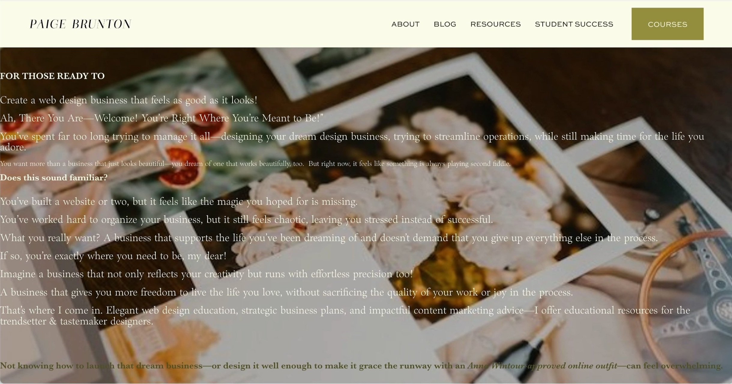
Need Help Getting Started?
If you’re struggling to figure out what should (and shouldn’t) go on your site, I’ve got you covered.
My Start Your Website Workbook walks you through everything—from understanding your audience to creating a layout that works. It’s designed to help you cut through the fluff and get straight to the point, while still reflecting your unique brand story.
Now that you’ve mastered the art of layouts, you might be wondering: how do you actually build a website that brings these principles to life?
Don’t worry—I’ve got you covered. Watch my step-by-step website building tutorial next for all the tech skills you need to create a professional, polished site.